2.11 Visualizing Distributions Via Simulation
To this point in the course, we have focused on concepts in “the population” with no reference to samples. This is on purpose! We want to develop the theory that defines the best possible predictor if we knew everything (if we know formula of the function that maps from \(\omega \rightarrow \mathbb{R}\), and we know the probability of each \(\omega \in \Omega\) then we know everything). Beginning in week 5 of the course, we will talk about “approximating” (which we will call estimating) this best possible predictor with a limited sample of data.
However, at this point, to help build your working understanding, or intuition, for what is happening, we are going to work on a way to simulate draws from a population. In some places, people might refer to these as Monte Carlo methods – this is because the method was developed by von Neumann & Ulam during World War II, and they needed a way to talk about it using a code name. They chose Monte Carlo after a famous casino in Monaco.
2.11.1 Example: The Uniform Distribution
You: “Gosh. There sure are a lot of examples that use the uniform distribution. That must be a really important statistical distribution.”
Instructor: “Nah. Not really. We’re just using the uniform a bunch so that we don’t get too lost in doing math while we’re working with these concepts.”
We’ll start with a simple uniform distribution, but then we’ll make it a little more complex in a moment.
We can use R to simulate draws from a probability distribution function by providing it with the name of the distribution that we’re considering, the support of that distribution, or other features of the distribution. In the case of the uniform, the entire distribution is can be described just from it support.
So, suppose that you had a uniform distribution that had positive probability on the range \([1.1, 4.3]\). Why these? No particular reason. That is, suppose
\[ f_{X}(x) = \begin{cases} a & 1.1 \leq x \leq 4.3 \\ 0 & otherwise \end{cases} \]
What does this distribution “look like”? Because it is a uniform, you might have a sense that it will be a horizontal line. But, what is the height of that line? Aha! We could do the math to figure it out, or we could generate an approximation using a simulation.
In the code below, we are going to create an object called samples_uniform that stores the results of the runif function call.
What is happening inside runif?
When you’re writing you own code, you can pull up the documentation for this (and any) function using a question mark, i.e. ?, followed by the function name – ?runif.
But, we can speed this up slightly by simply telling you that n is the number of samples to take from the population; min is the low-end of the support, and max is the high-end of the support.
If we look into this object, we can see the results of the function call. Below, we will show the first \(20\) elements of the samples_uniform object.
##  [1] 3.208866 1.494885 3.509101 1.398873 1.578894 2.291013 2.624383 4.145398
##  [9] 3.412919 3.828507 2.560717 2.979541 1.799375 2.606739 3.805492 3.699806
## [17] 4.037756 1.481315 3.038650 1.569686
(Notice that R is a \(1\) index language (python is a zero-index language).)
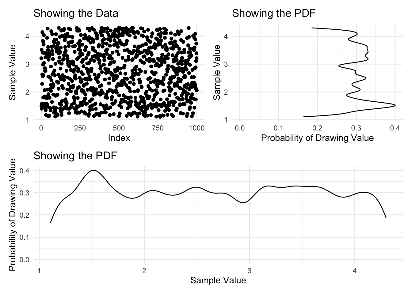
With this object created, we can plot a density of the data and then learn from this histogram what the pdf looks like.
Code
plot_full_data <- ggplot() +
  aes(x=1:length(samples_uniform), y=samples_uniform) +
  geom_point()  +
  labs(
    title = 'Showing the Data',
    y     = 'Sample Value',
    x     = 'Index')

plot_density <- ggplot() +
  aes(x=samples_uniform) +
  geom_density(bw=0.1)   +
  labs(
    title = 'Showing the PDF',
    y     = 'Probability of Drawing Value',
    x     = 'Sample Value')

(plot_full_data | (plot_density + coord_flip())) /
plot_density 
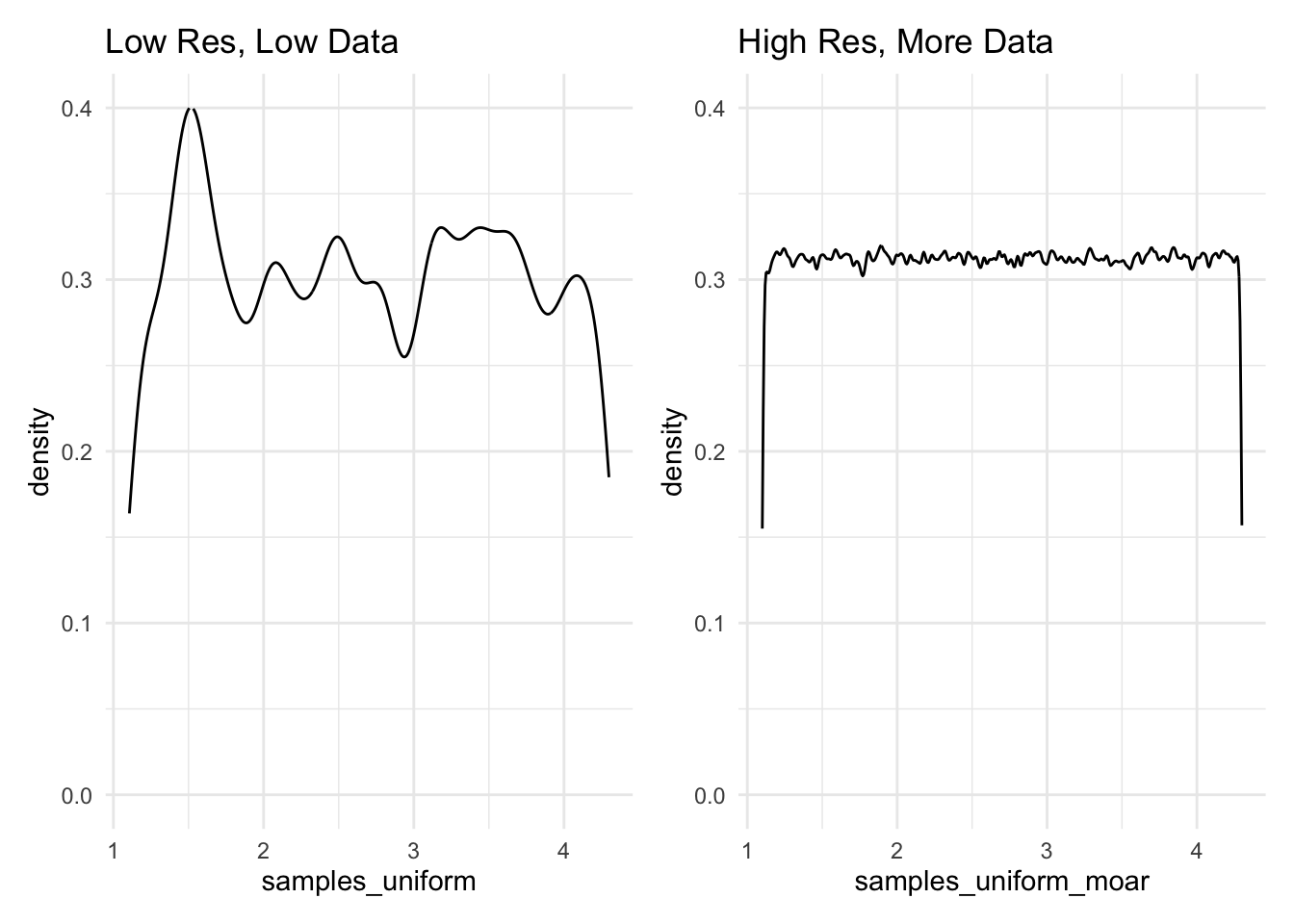
Interesting. From what we can see here, there does not appear to be any discernible pattern. This leaves us with two options: either, we might reduce the resolution that we’re using to view this pattern, or we might take more samples and hold the resolution constant. Below, two different plots show these differing approaches, and are very explicit about the code that creates them.
Code

2.11.2 Example: The Normal Distribution
Folks might have some prior beliefs about the Normal distribution. Don’t worry, we’ll cover this later in the course. But, this is the distribution that you have in mind when you’re thinking of a “bell curve”.
We can use the same method to visualize a normal distribution as we did for a uniform distribution. In this case, we would issue the call rnorm, together with the population parameters that define the population. At this point in the course, we do not expect that you will know these (and, actually memorizing these facts are not a core focus of the course), but you can look them up if you like. Truthfully, statistics wikipedia is very good.
Do do you notice anything about the runif and the rnorm calls that we have identified? Both seem to name the distribution: \(unif \approx uniform\) and \(norm \approx normal\), but prepened with a r? This is for “random draw”.
Base R is loaded with a pile of basic statistics distributions, which you can look into using ?distributions.
Like before, we could look at the first \(20\) of these samples.
##  [1] 13.008372 17.459266 17.567061 17.082533 27.429747 22.807132 15.014740
##  [8] 22.726304 18.645559 20.089418 23.330495 12.952501  8.727272 20.424133
## [15] 22.764265 18.596347 20.609944 11.939798 20.937353 10.101194
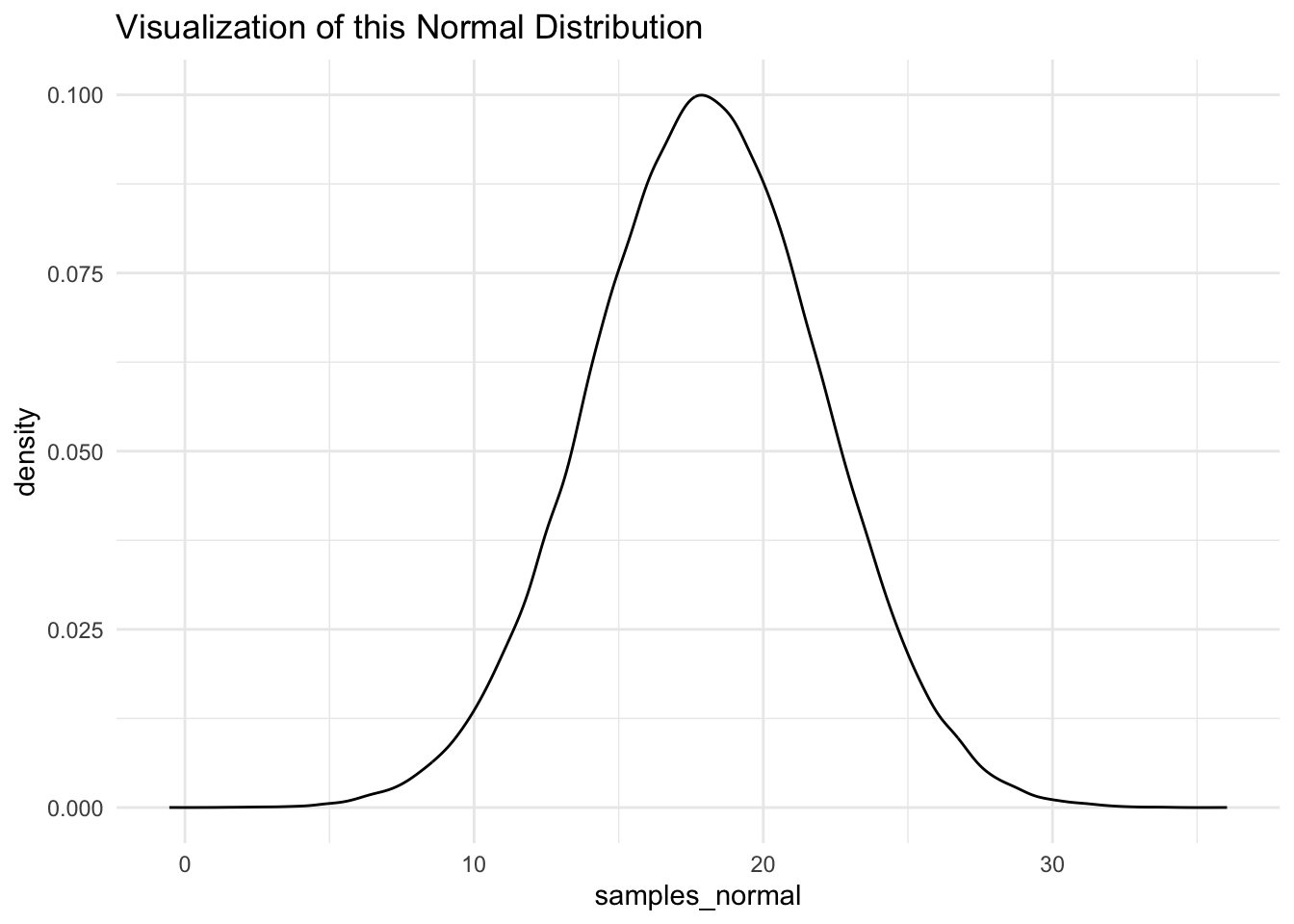
And, from here we could visualize this distribution.
Code

2.11.2.1 Combining This Ability
Consider three random variables \(A, B, C\). Suppose,
\[ \begin{aligned} A & \sim Uniform(min=1.1, max=4.3) \\ B & \sim Normal(mean=18, sd=4) \\ C = A + B \end{aligned} \]
And, suppose that \(B\) is a random variable that is described by the normal density that we considered earlier. Suppose that \(A\) and \(B\) are independent of each other.
Finally, suppose that \(C = A + 2B\).
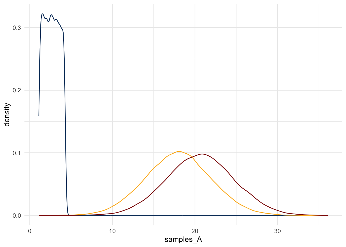
What does \(C\) look like?
Although this is a simple function applied to a random variable – a legal move – the math would be tedious. What if, instead, one used this simulation method to get a sense for the distribution?
Code
Code
